A CSS cheat sheet helps you quickly recall the most-used properties, selectors, and layout rules when you need to apply the right code without digging through multiple sources. That makes it especially useful for day-to-day layout work, style fixes, and interface adjustments.
Basic CSS principles
The CSS cheat sheet starts with three essentials: selector, property, and value. The selector targets the element on the page, the property defines what changes, and the value sets the result.
The simplest form looks like this:
- p — paragraph selector
- color — text color property
- #333 — value
The CSS cascade decides which rule wins when styles conflict. More specific selectors take priority, and if specificity is the same, the rule that appears later in the file usually wins.
The selectors you use most often
The CSS cheat sheet for selectors is most useful when it focuses on the patterns that actually show up in real layouts.
- p — element selector
- .card — class selector
- #header — ID selector
- nav a — descendant selector
- button:hover — state pseudo-class
- input:focus — form focus state
A quick check is to confirm in the browser inspector that the style is applied to the intended element. If a rule does not work, the usual causes are specificity, a typo in the class name, or another rule loaded later.
Core properties every layout needs
The CSS cheat sheet for everyday work almost always includes text, spacing, sizing, and the box model.
Text and color
The CSS cheat sheet for text usually comes down to a few key properties: color, font-size, font-weight, line-height, and text-align. These shape readability more than decorative effects do.
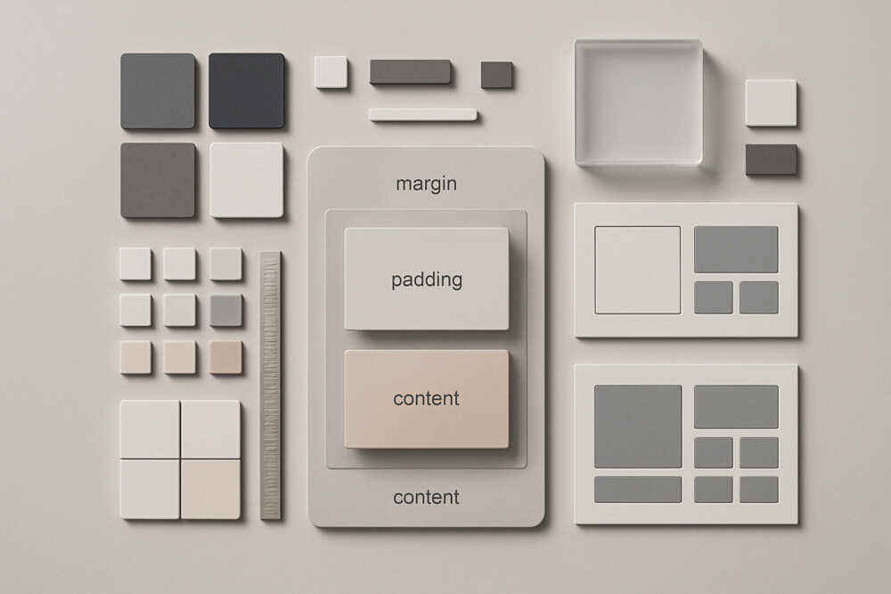
Spacing and sizing
The CSS cheat sheet for spacing should keep the difference between margin and padding clear: margin creates outer space, while padding creates inner space. For width and height, the most common properties are width, max-width, height, and min-height.
Box model
The CSS cheat sheet for the box model explains that an element’s actual size can change because of padding and border. To keep sizing predictable, many layouts use box-sizing: border-box;.
A practical check is simple: if a block starts behaving differently after you add padding, inspect box-sizing and compare the real dimensions in the browser inspector.
Flexbox and basic responsiveness
The CSS cheat sheet for modern layouts almost always includes Flexbox because it works well for aligning items in rows and columns.
- display: flex; — turns on a flex container
- justify-content — aligns items on the main axis
- align-items — aligns items on the cross axis
- gap — sets spacing between items
- flex-wrap — allows items to wrap
For responsiveness, the most common tools are max-width: 100%;, percentage-based widths, and media queries. If blocks break the grid on mobile, check fixed widths first, then large margins, then elements that cannot shrink.
Quick rules that save time
The CSS cheat sheet becomes genuinely useful when it includes not only properties but also a few reliable working habits.
- Check the selector first, then the value.
- Set box-sizing: border-box; early in new layouts.
- After changing flex settings, review wrapping, alignment, and spacing.
- If a style is not visible, look for another rule or a media query overriding it.
- For unstable blocks, test the layout in a narrow browser window.
A good CSS cheat sheet does not replace layout knowledge, but it does cut down the time spent on routine fixes. With the right selectors, core properties, and a few proven techniques at hand, even a more complex layout is easier to build without unnecessary pauses and searches.