CSS Grid cheat sheet is the fastest way to remember the key properties for building layouts, placing blocks, and making pages responsive without messy nesting.
What CSS Grid adds to everyday layout work
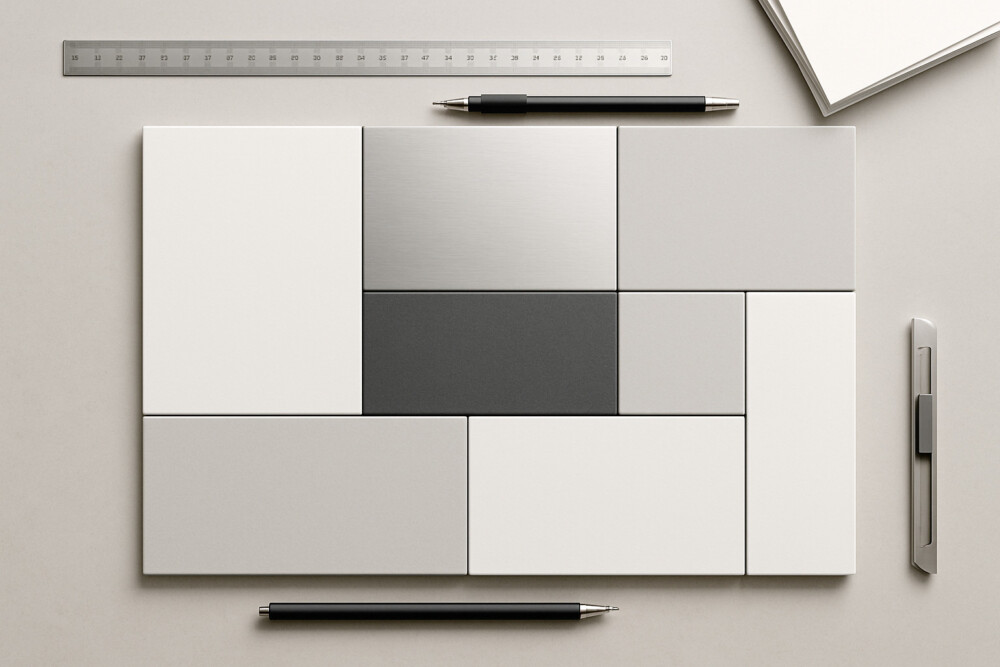
CSS Grid gives you a two-dimensional layout system, so you can control rows and columns at the same time. That makes it a strong fit for card layouts, galleries, dashboards, and complex page sections where flexbox alone can feel too linear.
The main advantage of CSS Grid is that you define the layout structure once, then place elements into the grid without extra wrappers. That keeps the code easier to read and makes responsive changes simpler.
Core Grid container properties
The foundation of a CSS Grid layout is a small set of container properties that define the grid structure.
- display: grid; turns Grid on for the parent element.
- grid-template-columns sets the number and width of columns.
- grid-template-rows sets the height of rows.
- gap controls spacing between items without margins.
- grid-auto-flow defines how items are placed automatically.
A practical starting point looks like this: display: grid; grid-template-columns: repeat(3, 1fr); gap: 16px;. This creates three equal columns with consistent spacing.
How to place items inside the grid
CSS Grid item placement works through grid lines or through shorthand properties that make positioning easier.
- grid-column sets how many columns an item spans.
- grid-row sets how many rows an item spans.
- grid-area places a block in a specific area of the layout.
- justify-items and align-items align content inside grid cells.
If an element needs to span a wider area, a rule like grid-column: 1 / 3; is enough. The check is simple: the block should extend across the expected columns without pushing neighboring items out of place.
Responsive grid without complex media queries
CSS Grid responsiveness often relies on repeat(auto-fit, minmax()), which lets the grid adjust the number of columns to the available width.
A common pattern looks like this: grid-template-columns: repeat(auto-fit, minmax(220px, 1fr));. It lets cards sit in one column on narrow screens and expand into multiple columns on wider ones.
Check the result directly in the browser by resizing the window and watching whether the layout stays readable and stable. If the columns become too narrow, increase the minimum value inside minmax().
Common mistakes that break a grid
A CSS Grid cheat sheet is more useful when it also highlights the mistakes that cause layout problems.
- Using too many fixed pixel values instead of flexible units.
- Trying to build every part of the layout with Grid when some inner elements are easier to align with flexbox.
- Leaving out gap, which makes blocks feel cramped.
- Positioning every item manually when the layout does not need that level of control.
If the grid behaves unexpectedly, first check the number of columns, the gap value, and whether items overlap because of incorrect row or column spans. For more complex layouts, it is safer to start with a simple three-column structure and only add complexity once the base grid works.
CSS Grid works best when a page needs a clear structural layout, not just a vertical flow of elements. That is why this CSS Grid cheat sheet is useful both as a quick reference and as a practical layout check during everyday work.