
Tailwind CSS can look unusual the first time you see it in a real HTML file. Instead of one neat custom class, a button, card, or section may carry a long row of utility classes right in the markup. At first, it feels crowded. Then the logic starts to click: you are not naming every tiny design decision in a separate CSS file. You are building the design directly from small, reusable utilities.
This Tailwind CSS Tutorial keeps that idea practical. You will set up Tailwind with Vite, learn the basic classes you actually need at the beginning, and build a responsive card layout that works on both mobile and desktop. Along the way, you will see how Tailwind handles spacing, typography, colors, layout, breakpoints, hover states, and the small details that often confuse beginners.
The point is not to memorize hundreds of class names. A first Tailwind project does not need to be a full landing page, dashboard, and component library at once. One clean card layout is enough to understand the mental model. Once that clicks, Tailwind becomes less about “too many classes” and more about knowing which small controls shape the design in front of you.
For more beginner-friendly software and web tutorials, you can also start from the HiTechNews homepage.
Quick Answer: What Should A Beginner Learn First In Tailwind CSS?
A beginner should first learn how Tailwind CSS utility classes control layout, spacing, color, typography, responsiveness, and states directly in HTML. The fastest way to understand Tailwind is to build one small interface and change the classes one group at a time.
Start with spacing classes like p-6, mt-4, and gap-4. Then learn text classes like text-xl, font-semibold, and text-gray-700. After that, move to layout classes like flex, grid, items-center, and justify-between. Once the static layout makes sense, add responsive prefixes like sm:, md:, and lg:, plus state variants like hover: and focus:.
Tested Setup For This Tutorial
Tailwind has become a common choice for modern frontend work because it lets developers build responsive interfaces quickly with utility classes instead of writing custom CSS for every small design decision. This tutorial uses a modern Tailwind setup instead of an old CDN-only approach.
- Tailwind CSS version: 4.3
- Build tool: Vite
- Package manager: npm
- Editor: VS Code
- Browser: Chrome
- Last checked: July 2026
- Project type: simple frontend layout
The official Tailwind documentation recommends using Tailwind CSS with Vite for many modern projects. The Vite setup uses the tailwindcss package together with @tailwindcss/vite.
Small note from testing: the hardest part for beginners is usually not the installation. It is recognizing which class controls which visual change. If something looks wrong, do not rewrite the whole layout. Remove or change one class group at a time: spacing first, then layout, then color, then typography.
What Tailwind CSS Does Differently From Regular CSS
In regular CSS, you often create a class name first and then decide what styles belong to it.
Example:
.card { padding: 24px; border-radius: 16px; background: white; box-shadow: 0 10px 25px rgba(0, 0, 0, 0.08);}Then you use that class in HTML:
<div class="card"> ...</div>Tailwind works differently. You usually place small utility classes directly in the HTML:
<div class="rounded-2xl bg-white p-6 shadow-lg"> ...</div>At first, that can look busy. The advantage is that you can build and adjust layouts quickly without switching back and forth between HTML and a CSS file for every small change.
A class like p-6 controls padding. A class like rounded-2xl controls border radius. A class like shadow-lg controls shadow. Once you know the pattern, the markup becomes readable.
How To Install Tailwind CSS With Vite
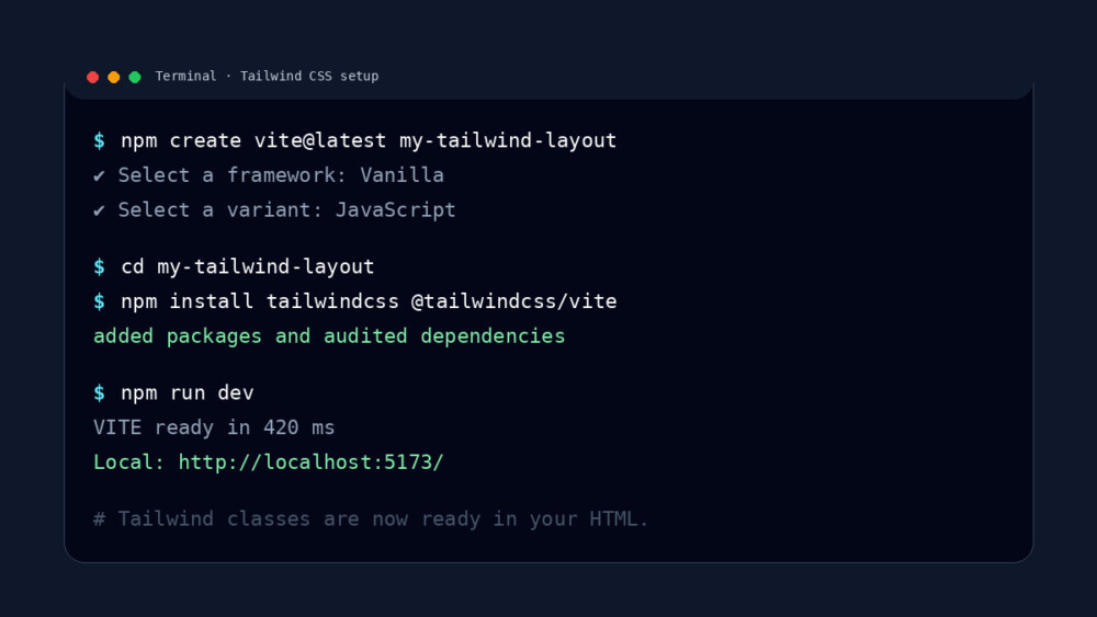
Create a new Vite project:
npm create vite@latest my-tailwind-layoutcd my-tailwind-layoutInstall Tailwind CSS and the Vite plugin:
npm install tailwindcss @tailwindcss/viteOpen vite.config.js or vite.config.ts and add the Tailwind plugin:
import { defineConfig } from 'vite'import tailwindcss from '@tailwindcss/vite'export default defineConfig({ plugins: [ tailwindcss(), ],})In your main CSS file, usually src/style.css, import Tailwind:
@import "tailwindcss";Start the development server:
npm run devNow you can use Tailwind classes in your HTML.
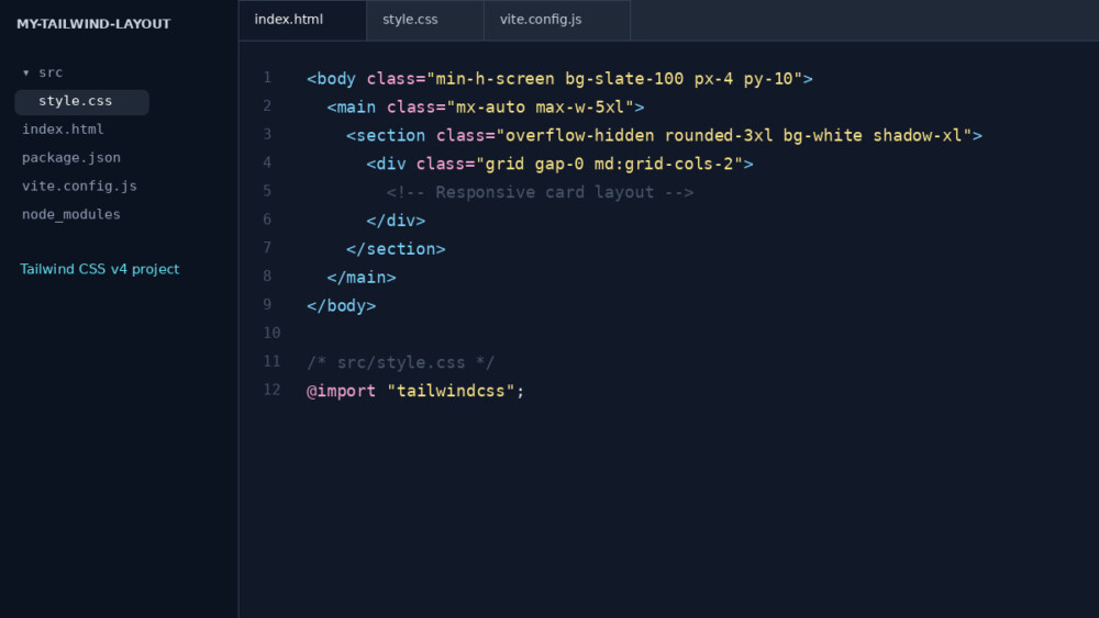
If the page loads but the design still looks plain, check the CSS import first. In most beginner mistakes I have seen, Tailwind is installed correctly, but @import "tailwindcss"; is missing from the main CSS file or the wrong stylesheet is linked in index.html.
How Utility Classes Work In Tailwind CSS
A utility class does one small job. That is the main thing to understand.
| Tailwind class | What it controls | Simple meaning |
p-6 | Padding | Adds inner spacing |
mt-4 | Margin top | Adds space above an element |
text-2xl | Font size | Makes text larger |
font-bold | Font weight | Makes text bold |
text-gray-600 | Text color | Makes text gray |
bg-white | Background color | Makes the background white |
rounded-xl | Border radius | Rounds the corners |
shadow-md | Box shadow | Adds depth |
flex | Layout | Turns an element into a flex container |
gap-4 | Spacing between children | Adds space inside flex or grid layouts |
The classes are small, but they combine into a full design. That is why Tailwind is often called a utility-first CSS framework.
The next section is where Tailwind starts to make sense. Reading class names in isolation is useful, but not enough. A class like p-8 becomes easier to remember when you see it create breathing room inside a real card.
Build Your First Tailwind Layout Step By Step
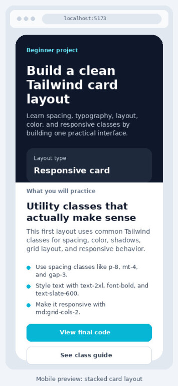
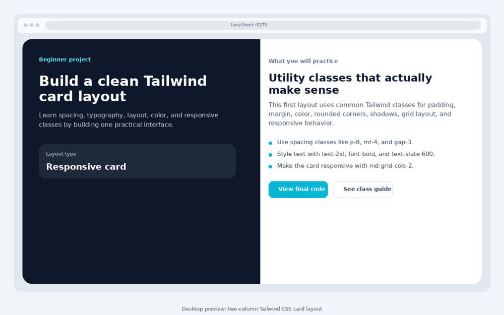
The layout below is a simple course card. On small screens, the content stacks vertically. On wider screens, it becomes a side-by-side card with a visual block on the left and content on the right.
Step 1: Create The Page Wrapper
Start with a page background and a centered container:
<body class="min-h-screen bg-slate-100 px-4 py-10"> <main class="mx-auto max-w-5xl"> <!-- Card will go here --> </main></body>The min-h-screen class makes the page at least as tall as the screen. The bg-slate-100 class gives the page a soft background. The px-4 and py-10 classes add horizontal and vertical spacing.
The mx-auto class centers the main container, while max-w-5xl keeps it from becoming too wide on large screens.
Step 2: Build The Card Container
Now add the card shell:
<section class="overflow-hidden rounded-3xl bg-white shadow-xl"> <div class="grid gap-0 md:grid-cols-2"> <!-- Left and right sides will go here --> </div></section>The card uses rounded-3xl for large rounded corners and shadow-xl for depth. The overflow-hidden class keeps the rounded corners clean when child elements touch the edge.
The grid class starts a grid layout. By default, the card stays in one column. The md:grid-cols-2 class changes it into two columns on medium screens and larger.
That is Tailwind’s mobile-first behavior: write the mobile layout first, then add larger-screen changes with prefixes like md:.
Step 3: Add The Visual Side
Add a simple visual panel on the left:
<div class="bg-slate-900 p-8 text-white"> <p class="text-sm font-semibold uppercase tracking-wide text-cyan-300"> Beginner project </p> <h2 class="mt-4 text-3xl font-bold tracking-tight"> Build a clean Tailwind card layout </h2> <p class="mt-4 text-slate-300"> Learn spacing, typography, layout, color, and responsive classes by building one practical interface. </p> <div class="mt-8 rounded-2xl bg-white/10 p-5"> <p class="text-sm text-slate-300">Layout type</p> <p class="mt-1 text-xl font-semibold">Responsive card</p> </div></div>The visual side uses a dark background with bg-slate-900. The text color is set to white using text-white. Smaller supporting text uses text-slate-300 so it feels softer than the heading.
The small label uses uppercase, tracking-wide, and text-cyan-300 to create a clear visual tag.
Step 4: Add The Content Side
Now add the right side of the card:
<div class="p-8"> <p class="text-sm font-medium text-slate-500"> What you will practice </p> <h3 class="mt-2 text-2xl font-bold text-slate-950"> Utility classes that actually make sense </h3> <p class="mt-4 text-slate-600"> This first layout uses common Tailwind classes for padding, margin, color, rounded corners, shadows, grid layout, and responsive behavior. </p> <ul class="mt-6 space-y-3 text-slate-700"> <li class="flex gap-3"> <span class="mt-1 h-2 w-2 rounded-full bg-cyan-500"></span> <span>Use spacing classes like <code>p-8</code>, <code>mt-4</code>, and <code>gap-3</code>.</span> </li> <li class="flex gap-3"> <span class="mt-1 h-2 w-2 rounded-full bg-cyan-500"></span> <span>Style text with <code>text-2xl</code>, <code>font-bold</code>, and <code>text-slate-600</code>.</span> </li> <li class="flex gap-3"> <span class="mt-1 h-2 w-2 rounded-full bg-cyan-500"></span> <span>Make the card responsive with <code>md:grid-cols-2</code>.</span> </li> </ul></div>This part introduces more useful classes. The space-y-3 class adds vertical spacing between list items. The flex and gap-3 classes keep each bullet dot and text aligned.
The code tags are regular HTML. Tailwind does not replace semantic HTML. It simply gives you small styling tools around it.
Step 5: Add Buttons With Hover And Focus States
Buttons are a good place to learn state variants:
<div class="mt-8 flex flex-col gap-3 sm:flex-row"> <a href="#final-code" class="rounded-xl bg-cyan-500 px-5 py-3 text-center font-semibold text-white transition hover:bg-cyan-600 focus:outline-none focus:ring-4 focus:ring-cyan-200" > View final code </a> <a href="#class-cheat-sheet" class="rounded-xl border border-slate-300 px-5 py-3 text-center font-semibold text-slate-700 transition hover:border-slate-400 hover:bg-slate-50 focus:outline-none focus:ring-4 focus:ring-slate-200" > See class guide </a></div>The hover:bg-cyan-600 class changes the button background on hover. The focus:ring-4 and focus:ring-cyan-200 classes make keyboard focus visible.
The buttons stack vertically by default because of flex-col. On small screens and larger, sm:flex-row places them side by side.
This is one reason Tailwind is not the same as inline styles. Utility classes can handle responsive behavior, hover states, focus states, and consistent design values.
Step 6: Make The Layout Responsive
The key responsive class in this example is:
md:grid-cols-2Without that class, the card stays as one column. With it, the layout becomes two columns at the medium breakpoint and above.
The button row uses:
sm:flex-rowThat means the buttons are stacked by default and become horizontal on small screens and wider.
Tailwind works mobile-first. Unprefixed classes apply to all screen sizes. Prefixed classes like sm: or md: apply only at that breakpoint and above.
This is a good moment to resize the browser slowly from mobile width to desktop width. Watch when the layout changes from one column to two columns. That breakpoint behavior is easier to understand visually than by reading the class name alone.
Final Code For The Responsive Tailwind Layout
Use this full example inside your Vite project after Tailwind is installed.
<!doctype html><html lang="en"> <head> <meta charset="UTF-8" /> <meta name="viewport" content="width=device-width, initial-scale=1.0" /> <title>First Tailwind CSS Layout</title> <link rel="stylesheet" href="/src/style.css" /> </head> <body class="min-h-screen bg-slate-100 px-4 py-10"> <main class="mx-auto max-w-5xl"> <section class="overflow-hidden rounded-3xl bg-white shadow-xl"> <div class="grid gap-0 md:grid-cols-2"> <div class="bg-slate-900 p-8 text-white"> <p class="text-sm font-semibold uppercase tracking-wide text-cyan-300"> Beginner project </p> <h1 class="mt-4 text-3xl font-bold tracking-tight"> Build a clean Tailwind card layout </h1> <p class="mt-4 text-slate-300"> Learn spacing, typography, layout, color, and responsive classes by building one practical interface. </p> <div class="mt-8 rounded-2xl bg-white/10 p-5"> <p class="text-sm text-slate-300">Layout type</p> <p class="mt-1 text-xl font-semibold">Responsive card</p> </div> </div> <div class="p-8"> <p class="text-sm font-medium text-slate-500"> What you will practice </p> <h2 class="mt-2 text-2xl font-bold text-slate-950"> Utility classes that actually make sense </h2> <p class="mt-4 text-slate-600"> This first layout uses common Tailwind classes for padding, margin, color, rounded corners, shadows, grid layout, and responsive behavior. </p> <ul class="mt-6 space-y-3 text-slate-700"> <li class="flex gap-3"> <span class="mt-1 h-2 w-2 rounded-full bg-cyan-500"></span> <span>Use spacing classes like <code>p-8</code>, <code>mt-4</code>, and <code>gap-3</code>.</span> </li> <li class="flex gap-3"> <span class="mt-1 h-2 w-2 rounded-full bg-cyan-500"></span> <span>Style text with <code>text-2xl</code>, <code>font-bold</code>, and <code>text-slate-600</code>.</span> </li> <li class="flex gap-3"> <span class="mt-1 h-2 w-2 rounded-full bg-cyan-500"></span> <span>Make the card responsive with <code>md:grid-cols-2</code>.</span> </li> </ul> <div class="mt-8 flex flex-col gap-3 sm:flex-row"> <a href="#" class="rounded-xl bg-cyan-500 px-5 py-3 text-center font-semibold text-white transition hover:bg-cyan-600 focus:outline-none focus:ring-4 focus:ring-cyan-200" > View final code </a> <a href="#" class="rounded-xl border border-slate-300 px-5 py-3 text-center font-semibold text-slate-700 transition hover:border-slate-400 hover:bg-slate-50 focus:outline-none focus:ring-4 focus:ring-slate-200" > See class guide </a> </div> </div> </div> </section> </main> </body></html>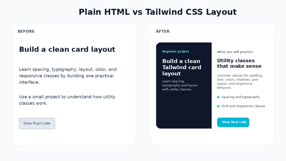
Editor’s Tip: After copying the final code, change only one thing at a time. Try replacing bg-slate-900 with another background color, then change p-8 to p-6, then remove md:grid-cols-2. Seeing what breaks, moves, or improves is one of the fastest ways to learn Tailwind CSS.
Tailwind Class Cheat Sheet For This Layout
| Class | What it does | Where it appears |
min-h-screen | Makes the body at least the height of the screen | Page wrapper |
bg-slate-100 | Adds a light gray-blue background | Body |
mx-auto | Centers the container horizontally | Main wrapper |
max-w-5xl | Limits the content width | Main wrapper |
rounded-3xl | Creates large rounded corners | Card |
shadow-xl | Adds a strong shadow | Card |
grid | Creates a grid layout | Card inner wrapper |
md:grid-cols-2 | Creates two columns on medium screens and up | Responsive layout |
p-8 | Adds padding | Card sections |
text-3xl | Makes the main heading large | Visual side |
font-bold | Makes text bold | Headings |
text-slate-600 | Uses a readable muted text color | Paragraphs |
space-y-3 | Adds vertical spacing between list items | List |
flex | Aligns child elements in a row or column | List items and buttons |
gap-3 | Adds space between flex items | List and buttons |
hover:bg-cyan-600 | Changes background on hover | Primary button |
focus:ring-4 | Adds a visible keyboard focus ring | Buttons |
This table is also a good debugging tool. If something looks wrong, find the class that controls that part of the design and change only that class first.
These mistakes are normal. Tailwind encourages fast experimentation, so beginners often add classes quickly and clean them up later. The goal is not to write perfect class lists from the start. The goal is to understand what each group of classes is doing.
Common Tailwind CSS Beginner Mistakes
Using Too Many Random Colors
Tailwind makes it easy to add color quickly, but that can become messy. A beginner layout often looks worse when every element uses a different color family.
A better approach is to pick one main accent color and one neutral family. In the example above, the neutral family is slate and the accent color is cyan.
Forgetting That Tailwind Is Mobile-First
This is one of the most common beginner mistakes. A class like md:grid-cols-2 does not mean “use two columns on mobile.” It means the layout becomes two columns at the medium breakpoint and larger.
Write the mobile version first with unprefixed classes. Then add sm:, md:, or lg: only when the layout needs to change on wider screens.
Mixing Conflicting Classes
Avoid writing classes that fight each other:
<div class="p-4 p-8"> ...</div>Both classes set padding. The final result may not be obvious when you are scanning a long class list. Keep one clear spacing class unless you are intentionally changing it at a breakpoint:
<div class="p-4 md:p-8"> ...</div>That version is clear. It uses smaller padding by default and larger padding on medium screens and wider.
Treating Tailwind Like Inline Styles
Tailwind classes sit inside HTML, but they are not the same as inline styles. Utility classes are still connected to a design system. They can also handle states and breakpoints, such as hover:bg-cyan-600, focus:ring-4, and md:grid-cols-2.
That is why Tailwind can stay consistent even when a layout is built quickly.
Skipping Focus States
Mouse users notice hover effects, but keyboard users need focus states. A button without a visible focus style can be hard to use.
This is better:
<a class="focus:outline-none focus:ring-4 focus:ring-cyan-200"> View final code</a>It makes the interactive element easier to see when someone tabs through the page.
When Plain CSS May Still Be Better
Tailwind is useful, but it does not replace every CSS decision. Plain CSS can still be better when you need complex animations, unusual art direction, advanced selectors, or reusable styles that would make the markup too crowded.
A realistic workflow often uses both. Tailwind handles most layout, spacing, typography, color, and responsive work. Custom CSS handles the few pieces that need special behavior.
That balance is healthier than forcing everything into one method.
What To Learn Next After This Tailwind CSS Tutorial
After building a first responsive layout, the next step is to rebuild the same card in a few variations. Change the colors, adjust the spacing, replace the grid with flex, and try different breakpoints.
Good next topics include:
- Tailwind responsive design
- Flexbox with Tailwind
- Grid layouts with Tailwind
- Hover, focus, and active states
- Dark mode
- Reusable components
- Form styling
- Navigation bars
- Landing page sections
For the official setup steps, use the Tailwind CSS installation with Vite documentation. For responsive behavior, the Tailwind responsive design documentation explains breakpoints, mobile-first classes, and how prefixed utilities work.
The important thing is to keep building small pieces. A card, a pricing block, a navbar, and a simple landing-page hero will teach more than reading a long class list. Tailwind becomes clear when every class has a visible job on the screen. Once you understand that, the framework feels much less like a wall of class names and much more like a practical layout language.